2015’s Top Design Trends
“Design is not just what it looks like and feels like. Design is how it works.”
― Steve Jobs
This year has seen such a burst of creative energy, and with it close to being over, we thought we would take a look at this year’s top design trends. Chances are you have probably seen some of these executed on your favorite websites.
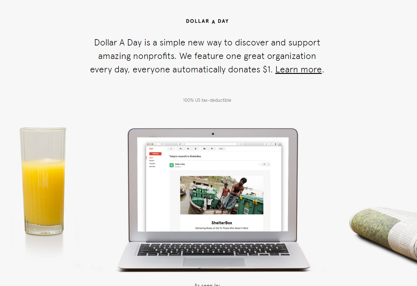
1. No clutter
Brands moved away from the cluttered pages with overflowing amounts of information, and focused on a simple, easy-to-navigate interface. Just remember, having a design style that is too minimal is just as bad as being cluttered.
2. Large (high-res) background images/video
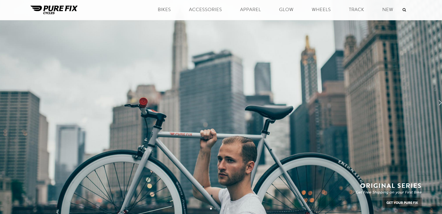
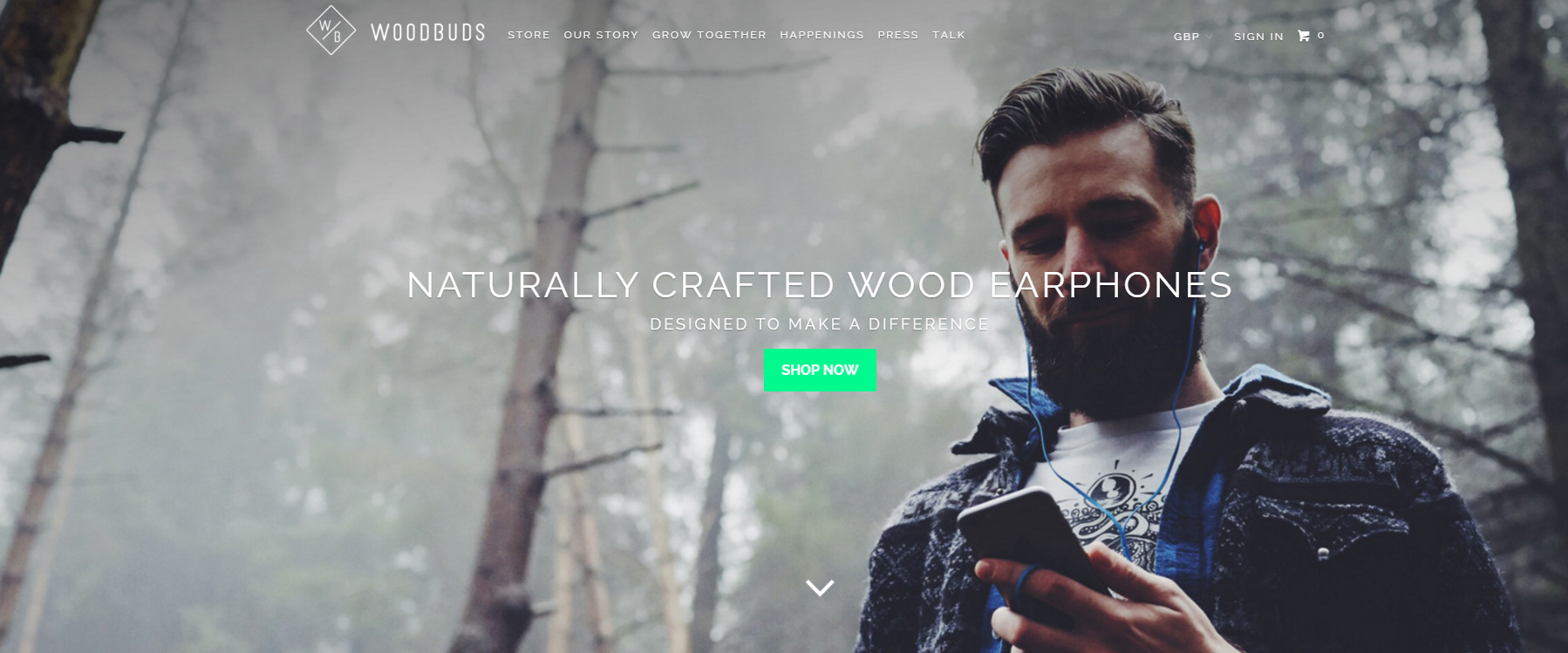
A lot of brands revamped this year and introduced videos, and large eye-catching images. The use of these bold and 3D backgrounds, is just one example of how design is evolving.
3. Parallax scrolling
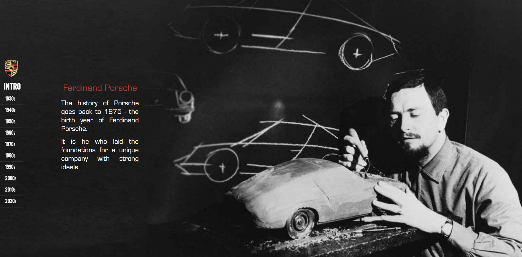
The use of parallax scrolling makes a webpage more like an interactive journey. A great use of this style is Porsche. By using parallax scrolling, Porsche gives you a history lesson, in a current and original way.
4. Typography
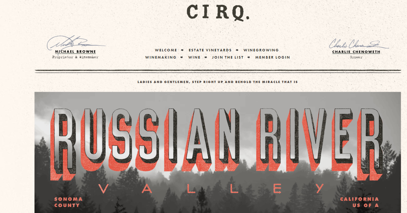
Designers have been going back to the basics, and perfecting their websites with dramatic typography. Used for much for than readability, typography can tie in a website’s brand and style.



Permalink