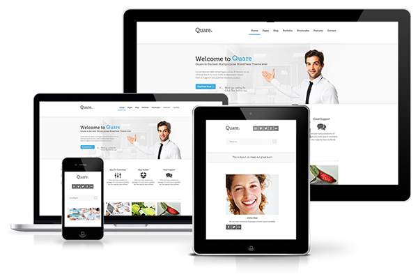
Responsive Design: Pros and Cons
By now it’s know that having a mobile marketing strategy for ad landing pages is important and necessary. There are currently three major accepted tactics for mobile devices: maintaining separate mobile URLs, responsive design, and dynamic serving.
Responsive design is when the layout is fluid and changes to adapt to whatever the visitor’s screen size is. Therefore, mobile and desktop visitors are served the same URL and content but it adapts based on the screen size, device type, and browser used.
On the other hand, dynamic serving and separate mobile URLs use different HTML codes or entirely different pages for mobile visitors.
Pros
1. Usable Across Many Devices
Responsive design is great and making sure all devices of all screen sizes have a great user experience. As newer devices with new dimensions are created, new resolutions and formats must be developed to work on everything from watches to tablets.
The benefit of a responsive site is that it is able to work on any future device as it adapts to look right on any device of any size.
2. Saving and Sharing
Responsive pages are easier for social sharing and SEM tactics because the page is designed for all dimensions so it doesn’t matter how it’s shared.
Mobile URLs shared on Facebook would get a poor user experience if they are on desktops, however with responsive design this isn’t an issue.
3. Managing Pages
It’s easier to update and make changes to responsive pages because you only need to make a change once. For companies with many landing pages, this is a huge benefit.
Cons
1. No Total Control
With responsive pages, it can be much harder (and sometimes impossible) to completely customize the visitor’s experience for a particular screen size/device.
With a separate mobile page, designers have complete control of a visitor’s experience on a given device. If you find that the vast majority of your mobile traffic is coming in through a specific screen size or type of device, then the control offered by mobile-specific landing pages might be the way to go.
2. Need More Up-Front Experience and Effort
Because responsive pages have to account for all screen sizes, this does make them inherently more complicated to initially create — not only more complicated from a design/user experience perspective but also from a technical/coding perspective.
This added complexity means that more up-front work is required before the landing page is live and ready to use. With a separate mobile experience, it is easier to create the two different pages, and there is the added benefit/flexibility of being able to launch one without the other.
3. Pages Load Slowly
If not created properly, responsive pages can have very slow page load times on mobile devices, which many studies have shown has a huge impact on the user experience and bounce rates.
The most common cause that I have found is images. If the same HD image is used for both desktops and smartphones and simply scaled down, the file size does not change, thus causing the page to load very slowly.
To avoid this problem, I recommend dynamically showing a smaller image size for only mobile devices. However, with separate mobile pages, this is not an issue because the images are created and sized specifically for that smaller page.
The other two options, dynamic serving and separate mobile URLs, involve serving different HTML code or entirely different pages to mobile visitors.


Permalink