How to keep your text clean
Readability is the most important thing when it comes to the text on your website. If the words aren’t readable then visitors are not going to get your message. Just as important as words themselves is the design of the text. From hyphenation, text size, fonts and organization of text on the screen. How you compose the “big words” on your site can make a great deal of difference.
Selecting your font
There are plenty of fonts out there and choosing them can be somewhat overwhelming, but just keep it simple. Choose only two to use throughout your website. Start with one font that will be used for the main body and a different one for larger text. Such as Headers, banners and breakout text. Using too many fonts can be distracting and confusing making it hard to read.
Sans serifs are the easiest to read when it comes to screen and size and works best for the main body copy. Serif fonts “run together” or lose their serifs depending on size, screen resolution and at times color contrast between text and background. Keep your body copy easy to read on a computer, tablet or mobile devices. Italics and bolding are great ways to show emphasis, however large blocks of these styles can become difficult to read.
Hyphenation
Hyphenations happen when there is a word split at the end of a line causing part of the word to appear at one end the rest to appear at the beginning of the next. Try to stay away from hyphenation. It’s not only bad, it’s often ugly, ineffective, and confusing. Hyphens were used to allow proper spacing across lines, but when using justified text and they are removed it creates odd spacing issues. Also, using hyphens can make text tough to read. Reading over a hyphen may cause the reader to stumble or misinterpret a word. Subconsciously it also tells the reader that the word is less important than the other words that are not hyphens.
Justification
Although it is still commonly used for print, full justification is no longer part of the web-design fashion. Justification is used to fill each line completely from left to right margin so every line has the same width. It creates spaces between words so the spacing is not disturbed. Certain websites can benefit from this, but it’s not the most appealing option.
English-language websites use left justification as the common practice. It feels friendly and easy to use, because this technique is common, readers will not notice how the text is set up. This is the best option for working with large text blocks.
Right alignment is another option however it doesn’t work well for chunks of text. With text aligned to the right and ragged to the left, the starting and stopping points are awkwardly on screen. Since the natural reading is reversed it can make the reader uncomfortable.
Center text is popular, although not recommended for large text. The reason being is because like right aligned text it does not have the “natural” flow and stops can make it feel awkward. Center-aligned text can feel formal because it’s often used in things such as invitations. It should be used for small bits of text where there is an emphasis. It’s also not a good choice for large blocks.
Conclusion
Having a clean copy is more than just using easy to read typefaces. It is about the writing copy that makes sense and being able to present it in a readable manner.
Always keep in mind who your audience is since different audience means different techniques. They have an impact on visuals they should impact your copy as well.
Most importantly, think about how it all comes together. Take down everything from your site just leaving your type. Is it easy to read? Is there a need to zoom in or out? do you have to squint? These are important questions to keep in mind because at the end of the day readability is where it matters.
Lastly, don’t forget that every page of your site can benefit from this clean text mentality. Many consumers in 2018 are looking at the backgrounds behind companies before they decide to make a purchase. Having a clean and clear “Our Story” page is a great way to demonstrate your company’s values and even help to boost sales!
Here are 3 “Our Story” company pages that are very clean and would serve as a great template for any company trying to make their website and story more readable:
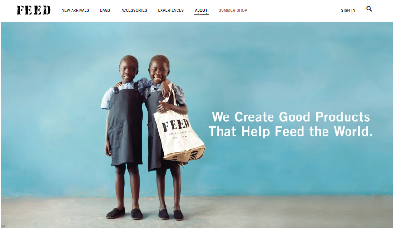
Example 1: Feed

A great example of how sometimes less is more. This page is very easy on the eyes and even easier to read due to the white font against the light blue backdrop.
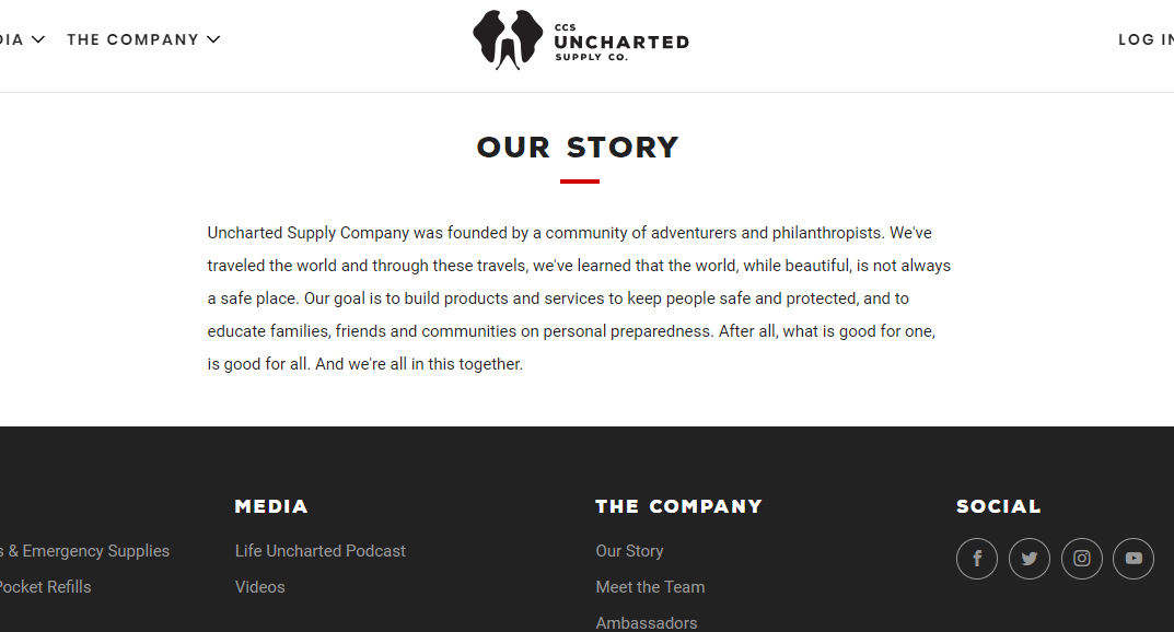
Example 2: Uncharted Supply Co

A great example of using center text to emphasize the importance of the paragraph.
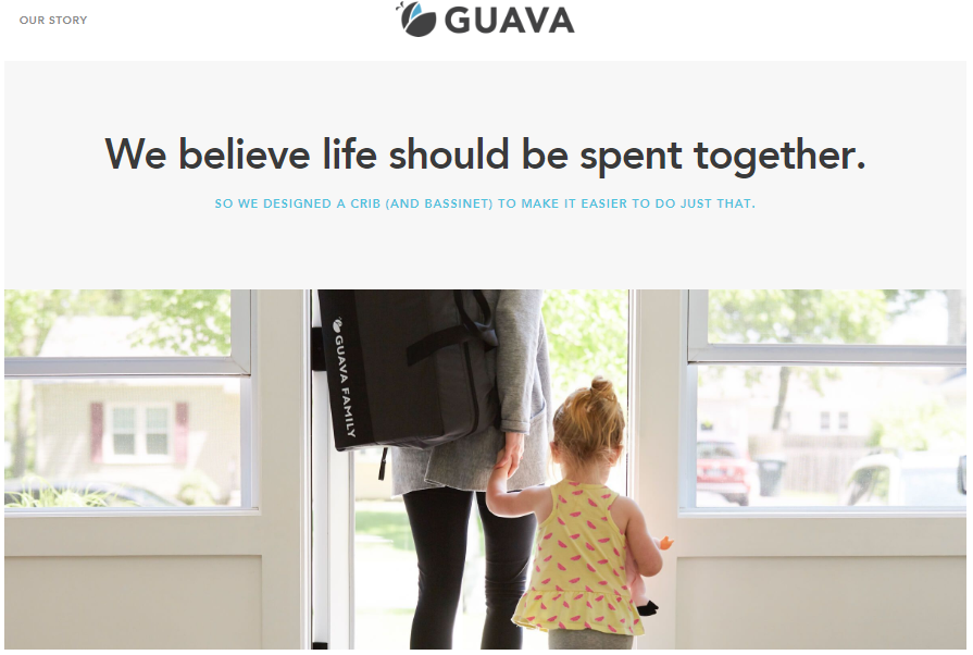
Example 3: Guava Family

A great example of using large, bold, and concise text to portray the company’s core values. The image also emphasizes the same values.


