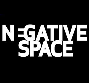
Using negative space as design element
Using negative space is an important element in design. No matter if its for websites or logos. It can be a tricky process to combine negative space but once it’s accomplished, it is not something to be overlooked or avoided. A lot of designers make the mistake of designing with too much information and forgeting about spacing. A good tip to remember for anyone starting out is to build a minimal website with less content and use negative space. It will make you look professional.
What is negative space?
Negative space is also known as white space. These are spaces without any elements although they are called white space, “negative space” does not need to be white. Any color can be used as long as there are no elelments. It is also a design factor that is not easily recognizable. It adds symmetry to your layout and makes it look clean for your visitors.
Negative space in web design
A webpage layout includes objects, images, and text that are arrangened in an attractive manner. This would also include negative space. This helps the viewers keep focus on objects. Negative space should be used to align or balance objects in a design to make it appealing. To produce a good web layout with negative space make sure your spacing between objects are consistent. Other wise it can destroy the layout causing distractions to viewers by easily spotting the inconsistencies of spacing which might cause your viewers to leave your site.


