Google’s New Look
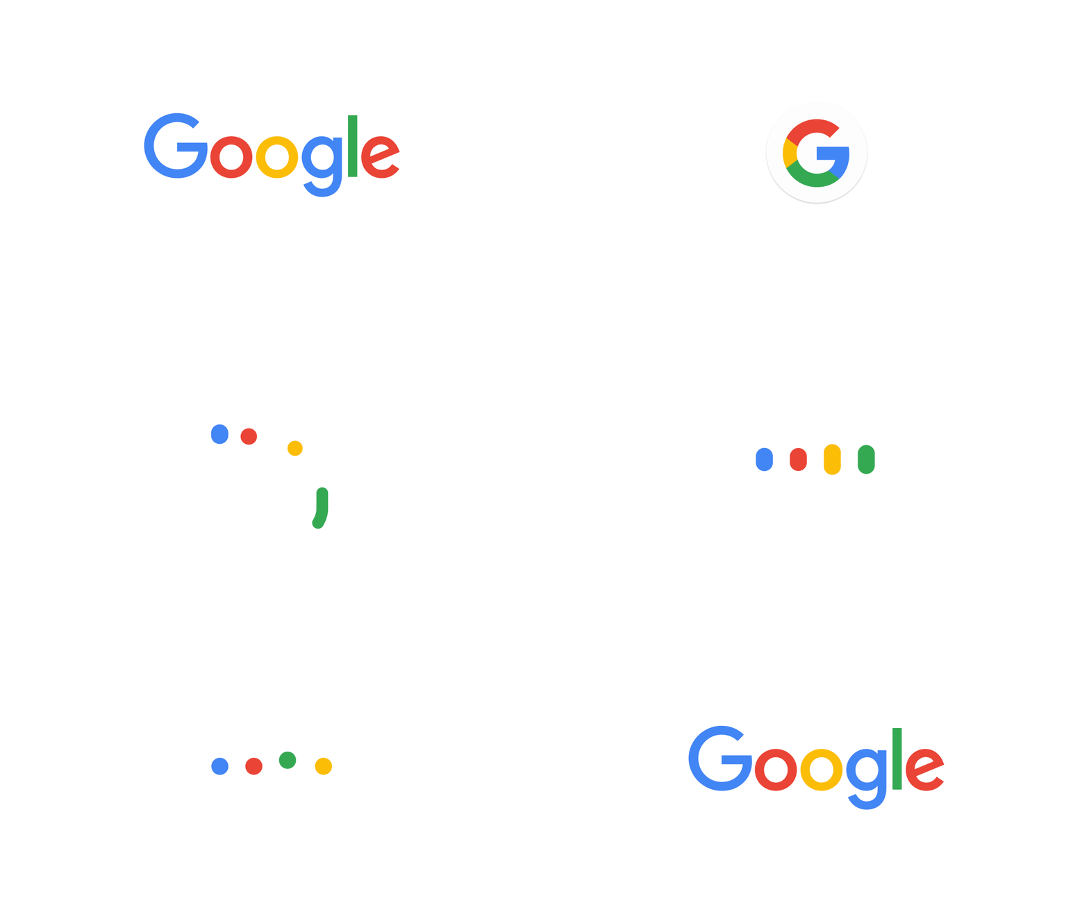
Google is infamous for shaking things up, and today is no different! With a cute little animation, Google’s revealed a clean new logo design!
Today we’re introducing a new logo and identity family that reflects this reality and shows you when the Google magic is working for you, even on the tiniest screens. As you’ll see, we’ve taken the Google logo and branding, which were originally built for a single desktop browser page, and updated them for a world of seamless computing across an endless number of devices and different kinds of inputs (such as tap, type and talk).
The update to the logo includes other useful components such as a Google mic that will allow you to interact with Google through talking, tapping, or typing. They have also done away with the little blue “g” icon and updated it to a colorful, cleaner version that matches the new logo.
 While this isn’t the first time Google has made updates to its logo, and they even say it won’t be the last, they’re confident this update is a strong reflection of how they’re there to work for you across Search, Maps, Gmail, Chrome, and more.


